LinkedIn is refreshing its entire site with a new look that’s designed to bring the aging social network firmly into the 21st century. LinkedIn’s new design makes navigating the site a lot easier.
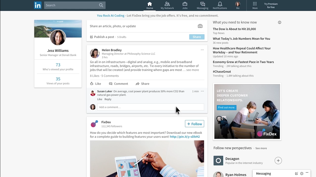
The main feed now looks a lot more like what you’d find on Facebook, with trending stories that are curated by human editors and algorithms, and you can unfollow and hide posts easily (just like Facebook).
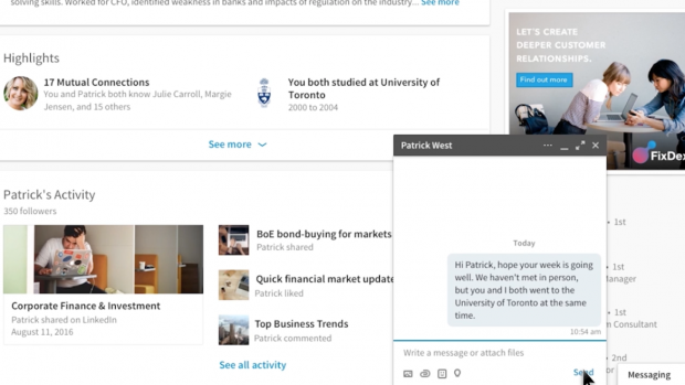
LinkedIn is also improving its search interface so it’s easier to find jobs, people, companies, and other parts of the social network. Perhaps the biggest change is a new real-time messaging interface that’s always available at the bottom of every page.
There are now seven sections to navigate through: Home, messaging, jobs, notifications, me, my network, and search. Each one also changes the design and makes it clearer and cleaner. In addition, in the side column, there is always a tab with the basic data of the user profile.
Now users will enjoy a more modern, functional and a beautiful LinkedIn. Have you tried it yet?